Wednesday, November 30, 2011

Relief printing!

4 colour lino reduction! Part of my series on the feminine. I've found very much joy in relief this semester.

FOR SALE! $30 each
Edition of 5

Tuesday, November 22, 2011

Trophy wife!

One colour lino print!

FOR SALE!

Sylvia Ji inspired portrait

Ahh, back to doing what I love most; pretty ladies with big hair. Final portrait piece for my Drawing: Portraiture class. I used watercolour, ink, coloured pencil, oil pastel, chalk pastel, acrylic paint, sweat, tears and blood. It's approximately 15"x20"

FOR SALE!

Monday, November 7, 2011

Prints!

I haven't posted any of my prints from this semester yet! This is a line etching and lino reduction.

Monday, October 31, 2011

Portrait Assignment 2

My second assignment for my Drawing: Portraiture class called for either a weirdly reflected portrait or a portrait from a weird angle with dramatic lighting. I took a photo of a body piercer about to pierce his own septum under an overhead light found in a tattoo shop. I'm very pleased with how it turned out, despite running into some difficulty with the medium and my kitten. This piece is 19" x 25" and is Prismacolor Nupastel and charcoal.

Wednesday, October 5, 2011

Portrait drawing Assignment 1


This is a charcoal portrait drawing I did of a friend for my drawing class with Lorne Toews. I'm quite pleased with how it turned out. It's 17"x14.5" and looks better in real life.

Sunday, July 31, 2011

Tattoo Flash 4

Another flash piece for my apprenticeship. I actually really love how this came out and I'll be tattooing it on someone's leg, woo!

Outline:


Coloured:

Saturday, July 23, 2011

Tattoo Flash 3

I've been working pretty hard on all my my flash stuff for the apprenticeship. This is one of my favorites and also one of the most recent. I feel like this would look incredible as a thigh piece. I'm currently obsessed with all the colours used in this. I'm going to blame that on watching Yovany tattoo with all the beautiful blues and greens.

Outline:


Finished

Saturday, June 25, 2011

Tattoo Flash 2

These are the second drawings I did for my flash sheet. I hate this one. I was told to add the dead dove and it took like like, 2-3 weeks to get it right. Stupid dove.

Outline:


Coloured:

Wednesday, June 22, 2011

Tattoo Flash 1

Well, it's been quite awhile since I've posted anything. I've been busy with summer school and working on a tattoo flash sheet of detailed woman's heads. They have been killing me, but it's nice to have a cohesive pile of work. The piece I've posted below is for the theme of death. My composition isn't the strongest, but I'm quite pleased with the colours.

Outline:


Coloured:


There are 5 pieces in this set, and over the course of two short months I've seen a major improvement in my control and composition. I just bought my tattoo machines and power supply over the weekend and will be starting to practice on fake skin shortly.

Thursday, April 28, 2011

Apprenticeship Week 1

After 3 days of apprenticing this week, this is what I've come out with -- a lot of the same thing.
I was asked to draw a piece for someone's right shoulder blade, incorporating 3 elements. I was working without reference and it really sucked. I must say, I'm pretty impressed by my ability to turn a page of scribbles into something I'm happy with. I was having trouble at first getting a good flow in my image. I have my rough copy that looks terrible, a pencil version, an ink draft, an ink outline, and a coloured version. Below is a photo of all the sheets of the same thing.


This is my final outline and the coloured version

Sunday, April 17, 2011

Personal work

This was a piece I did after being offered a tattoo apprenticeship and space on the walls of Blugod Studio for my work. I was told to look up the work of Emily Rose Murray and got incredibly inspired. I was also watching some tattoo movie while I was enduring my visit to the shop this week and it stated that coloured pencil on vellum looks similar to how ink looks on skin, so I decided to give it a shot. I'm pleased with the results. This is 11"x17" and will be on the walls of Blugod shortly. :)

Tuesday, April 12, 2011

Metaphor, Image and Process

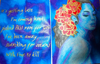
For my dream book I decided to illustrate the song "China White" by He Is Legend though my day dreams and visualizations of the lyrics. These photos aren't the best. This was done mostly in oil pastel, with some coloured pencil, graphite, acrylic ink and patience.

Front/Back cover (Thanks Emily for the pretty paper)


Inside cover; this is hard to see because its gold. Shiny :)


Pages 2 and 3; text and roses outlines are gold


Page 4 and 5; text and parts of roses are gold


Page 6 and 7; text is super hard to see, stupid gold.


Inside back cover:

What a relief.

I really like that pun. I finished all of my relief assignments a week early and I'm really pleased with them.

Collograph (used gel medium, paper and masonite):


Engraving: This was a nightmare to carve.


"The Challenge" 3 colour lino reduction. I'm incredible impressed with my ability to do this. I love this print more than anyone will know hahaha.

Intaglio suicide

For my last Intaglio assignment, I thought it'd be a great idea to do a giant 12x18 copper plate. Bad idea. The plate took me 15 hours, printing took me 7 hours. It didn't come out the way I wanted it too, but I was running out of time so I settled. I might go back into it over the summer, I'm not sure yet. Rudolf seemed to like it when I was printing and taught me a neat little trick to getting fingerprints off :)

Man and Machine

Last project for Harvey Chan's Media Studio. I really wish I could've had some more time with this. I had no idea what to do so I was playing with human interaction with machine.

Experiment:


Final:

Thursday, March 17, 2011

Harvey Chan Reoccurring Dreams

Reoccurring Dream project for Media Studio. My concept was birds' nest hair!

Experiment:

Done in graphite, charcoal, ballpoint pen and coloured pencil.

Final

Done in oil pasel, conte, graphite, ballpoint pen and coloured pencil

Friday, March 4, 2011

Woodblock Print

While sitting at home, not feeling well I began to carve a block of wood and then proceeded to pick up a roller and water-based ink to experiment in my bedroom. I doubt I'll use water-based ink again, but I quite enjoy hand printing. The wood grain in the background was a happy accident, I love it. I'm pretty pleased with this for completing it start to finish in less than 18 hours. There are 8 of these.

Wednesday, March 2, 2011

The Beast

This is my final version of the beast, done in oils. Entirely done in 6 colours, woo. The colour of the left side is a bit off due to a glare, so ignore that.

Saturday, February 26, 2011

New creations

So I have a bunch of work I've finished in the past two weeks, figured it was time for an update. First up we have an experiment for Harvey Chan's class. We had to work in acrylic or oils and since I had never really worked in oils before I chose that. It's safe to say I love them. The theme is "The Beast" so I threw a ram's skull on a girls body. I like the idea I came up with, but the image needs a lot of work. The final one will be up shortly.


Next is my completely lino print for Relief. Image is of Medusa, done in a reduction block. 3 colours hand printed are not so fun. White was printed first, then pink, then black. I'm incredibly happy with how these turned out.


This is one half of a diptych for Metaphor, Image and Process. The assignment is working with archetypes for the body. I'm incredibly interested in the body as a medium and extended that into tattoo art and the history of tattooing. Notice the gypsy on his left arm. Self promotion, yeh.


This is an aquatint done for Intaglio. I did a line etching first, left it in the acid for 20 minutes. Next came sugarlift on the owl to open up all those spaces for the aquatint. Aquatint was done in 3 stages, each shade is an extra 5 minutes left in the acid. I might go in and rework the background, I'm not completely sure yet though. I'm super happy with this image as it was my first aquatint. Woohoo!

Wednesday, February 9, 2011

Harry Houdini tattoo anyone?

So, this is my final project for the "Funeral of a Magician" project for Media Studio. After restarting this TWICE, I finally finished. Done entirely in ink and watercolour. The blacks and reds are ink, and everything else is watercolour. First time around, I was going to do a poster for one of Houdini's stunt's the Chinese Water Torture Cell, except I was going to do the cell in a coffin shape. Didn't work out. Then I had this drawn up, was going to do the portrait in black and white and the rest in colour, but the portrait came out too dark and muddy, so the dearest Emily let me borrow her light board to trace the portrait to save some time. Thanks Emily! I'm pretty pleased with how this turned out. This is 12"x16"

Tuesday, February 1, 2011

Harry Houdini

"Funeral of a Magician" is the theme for the ink and watercolour work in Media Studio. For my experiments, I did a portrait of Harry Houdini. Using calligraphy pens to play with line, and brush and ink for everything else. The yellowish colour of the letters is done in tea. One of the dot things on the "O" smudged so I'm a little bitter.

For the final piece I'm thinking of working with Houdini's grave, and illustrate him escaping his own tomb like the stunt he did where he buried himself alive. I'm unsure as of now.

Sunday, January 30, 2011

Dream Archetypes

So after a long, long weekend of painting, I have finally completed my set of tarot cards. In my previous post I put up the Femme Fatale, or the shadow, of the two. Next to do was the contrasting archetype, the Virgin. Here are the two works together:

The Femme Fatale is described as a woman with "highly refined skills at manipulating men both sexually and financially without investing personal emotion". Other ways to describe a femme fatale are "black widow", "flirt", "siren", etc. I depicted her in cold and dark colours to emphasize the evil nature. She has skulls and a spider in her hair because she is "deadly".

The Virgin is associated with purity and innocence. The ego of the set is done in bright warm colours to send the message of "goodness". She has lilies in her hair because they are a symbol of femininity and purity.

The faces of the women are the same, just mirrored. Allowing the two portraits to depict the same person draws the conclusion that one person is capable of holding qualities of both the femme fatale and virgin.

I'm very pleased with how these came out.

Saturday, January 29, 2011

Femme Fatale

Metaphor, Image and Process called for dream archetype tarot cards. We are required to do 2, the ego and the shadow. The following painting is my shadow, the femme fatale. I'm not 100% sure this is done yet.

Thursday, January 27, 2011

Acid baths and lino cutters

Today was a pretty productive day. I was able to etch and do a proof print of my insect project for my intaglio class. Since I hate insects, the beetle was given is small and hidden in the mass of hair. Portraits are prettier than bugs anyway. This can be seen here:


Next up is my relief project. This is the first layer of a 3 colour reduction print. All the darker parts will be printed in white, then I'll go back to the block and cut more away. The black lines are just from where I was marking my cutting. It's going to be a print of Medusa, since I have this crazy fascination with female monsters right now.

Tuesday, January 25, 2011

Love and Birthdays!

For Media Studio, we had to use the gouache-ink resistance technique I used in one of the pieces in my last post to illustrate love. We were required to include 6 images. I chose to do one image with smaller elements in it. The work contains a rose, the figure of a woman, physical love and fertility, blowing a kiss, hearts, doves, a figure being shot by cupid's arrow with arrows floating around, fireworks. All symbols of love. Also, apparently triangles are also a symbol of love? Who knows.


Happy Birthday. I made this as a card/drawing for one of my friends/roommates for his birthday. I thought it was neat and was really my first time working with coloured pencils. I doubt I'll use them again.

Tuesday, January 18, 2011

New Semester

So begins a new semester. I just finished two minimal projects for Metaphor, Image and Process (Drawing) and Media Studio (Illustration). For the drawing class, we had to create a dream object. I chose this funny looking representation of a heart because I often dream about my mom and her illnesses.


For the illustration class, we had to experiment with the gouache-ink resistance technique. This image is the last one I did of 3, and I am quite pleased with it.

Sunday, January 2, 2011

Sylvia Ji and ink

This piece I did at the end of my first year of school. I was really interested in the work of Sylvia Ji when I started doing all these types of pieces. The hair in this almost killed me.

Portraits

Last semester I got really into painting portraits. The first piece shown is a portrait of Megan Fox, and the second is of some model I found in one of my friends magazines. I quite enjoy the painterly style these were done in.